
In this tutorial, we’ll unpack the difference between margin and padding, when to use each, and how to apply them effectively for both desktop and mobile views. By the end, you’ll not only know what these properties do, but why using them right leads to a clean, responsive, and professional layout.
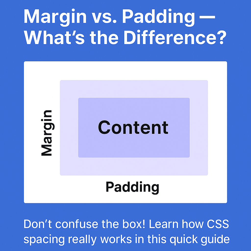
Before You Begin: Understanding the Box Model
To fully grasp margin vs. padding, let’s quickly revisit the CSS Box Model — the foundation of all layout styling:
Each element on your page is a box, and that box has four main parts:
- Content – Your actual text, image, etc.
- Padding – Space inside the element, between content and border.
- Border – Optional boundary around the element.
- Margin – Space outside the element, between it and other elements.
Margin vs. Padding: What’s the Difference?
Margin = Space Outside
Margins create space around elements. Think of it like pushing boxes away from each other.
.card {
  margin: 20px;
}
This pushes the entire .card element 20px away from other elements on all sides.
Padding = Space Inside
Padding creates space inside the element’s border, pushing the content inward.
.card {
  padding: 20px;
}
This adds breathing room within the card, so the content doesn’t touch the edges.
Real-World Code Examples
Example 1: Creating Separation Between Sections
<section class="about">
  <h2>About Me</h2>
  <p>I’m a front-end developer…</p>
</section>

<section class="services">
  <h2>Services</h2>
  <p>I offer design and development…</p>
</section>
section {
  margin-bottom: 40px; /* Adds space between sections */
  padding: 20px;        /* Adds space inside the section box */
  background: #f9f9f9;
  border-radius: 8px;
}
Best Practice: Use margin to separate elements from each other and padding to make content within an element easier to read.
Example 2: Responsive Spacing for Mobile
.card {
  padding: 24px;
  margin: 32px auto;
  max-width: 600px;
}

@media (max-width: 600px) {
  .card {
    padding: 16px;
    margin: 16px;
  }
}


 Tip: On smaller screens, reduce padding and margin to maximize space. Always test your layout on both mobile and desktop!
Best Practices for Clean UI
| Tip | What It Means |
|---|---|
| Consistent Spacing Scale | Stick to a spacing system (like 8px steps: 8, 16, 24, 32…) |
| Avoid Margin Collisions | Don’t rely on top + bottom margins stacking — it can be unpredictable |
| Use Padding for Readability | Give text elements room to breathe |
| Separate Layout & Component | Let containers handle layout with margin; use padding for inner spacing |
| Use Utility Classes | In frameworks like Tailwind or Bootstrap, use spacing utilities consistently |
Margin & Padding Shorthand
Here’s how you can quickly apply spacing with shorthand:
/* One value: all sides */
padding: 16px;

/* Two values: top-bottom | left-right */
margin: 20px 40px;

/* Three values: top | left-right | bottom */
padding: 10px 20px 30px;

/* Four values: top | right | bottom | left */
margin: 5px 10px 15px 20px;
When to Use Margin vs. Padding on Mobile vs. Desktop
| Scenario | Use Margin ✅ | Use Padding ✅ |
|---|---|---|
| Add space between buttons | ✅ | ❌ |
| Add space inside a button | ❌ | ✅ |
| Space between cards or sections | ✅ | ❌ |
| Add room inside a text box/container | ❌ | ✅ |
| Responsive adjustments | ✅ (layout) | ✅ (content) |
Visual Aid: Margin vs. Padding
(Insert your visual graphic here)
A flat illustration showing an element box with labeled zones: Content → Padding → Border → Margin.
Key Takeaway: Use Margin to Separate, Padding to Breathe
If you remember one thing, let it be this:
Margin separates elements. Padding gives content breathing room.
Understanding and using both correctly is what separates a cluttered UI from a clean, modern one — especially important in responsive and mobile-friendly design.
Happy styling!
Got questions or want a live example? Drop a comment below or reach out.