
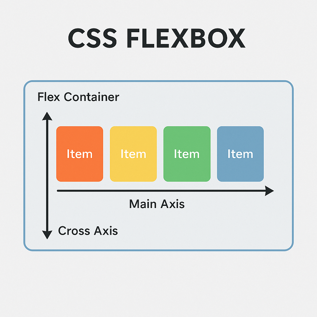
Flexbox (Flexible Box Layout) is a one-dimensional CSS layout system that arranges items horizontally (row) or vertically (column) and adapts them to available space. It’s perfect for dynamic, content-driven designs.
Basic Flexbox Setup
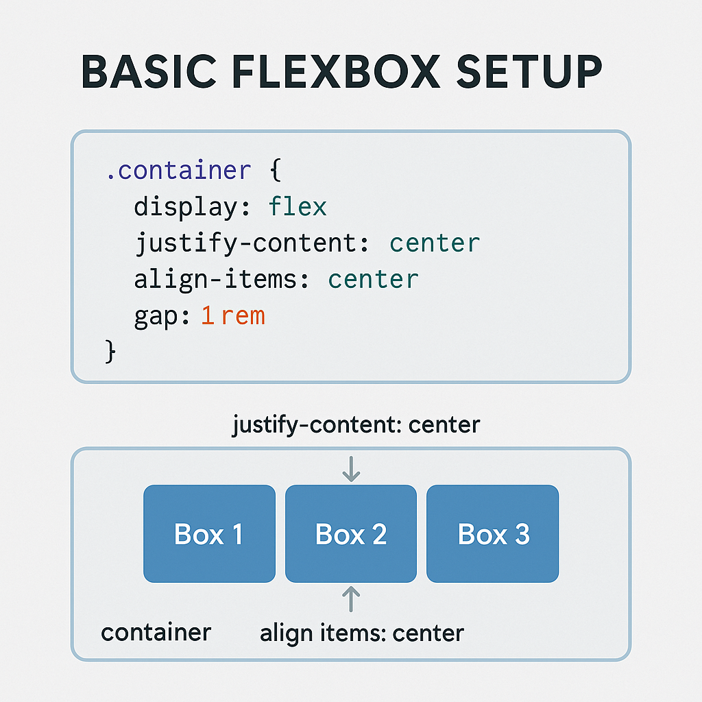
.container {
  display: flex;
  justify-content: center;   /* Align items along the main axis */
  align-items: center;       /* Align items along the cross axis */
  gap: 1rem;                 /* Modern spacing between items */
}
<div class="container">
  <div class="box">Box 1</div>
  <div class="box">Box 2</div>
  <div class="box">Box 3</div>
</div>
.box {
  background: #4f46e5;
  color: white;
  padding: 1rem 2rem;
  border-radius: 10px;
}
Main Flexbox Properties
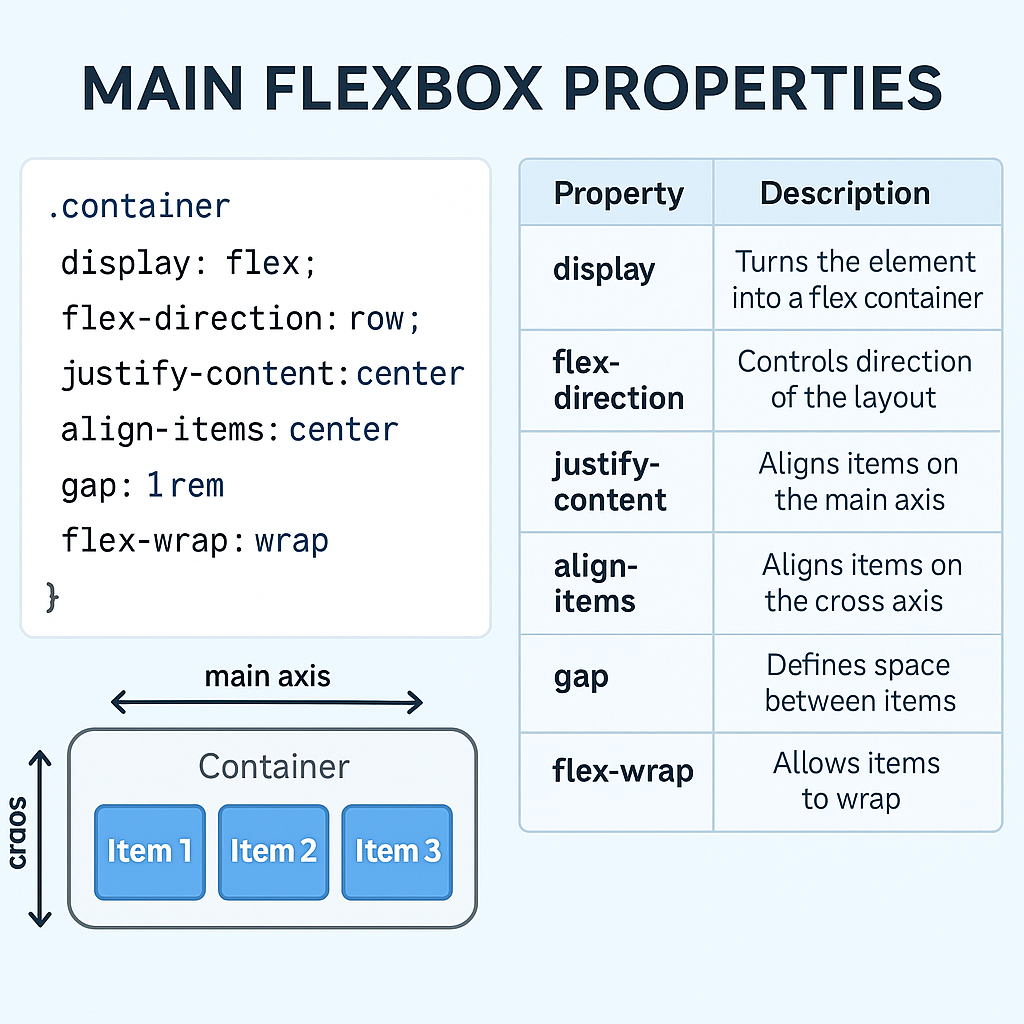
| Property | Purpose |
|---|---|
display: flex | Turns the element into a flex container |
flex-direction | Direction of layout: row, column |
justify-content | Aligns items on the main axis |
align-items | Aligns items on the cross axis |
gap | Adds space between flex items (modern!) |
flex-wrap | Allows wrapping (wrap, nowrap) |
flex | Defines grow, shrink, and basis |
Responsive Flexbox Layout
.container {
  display: flex;
  flex-wrap: wrap;
  justify-content: space-between;
  gap: 1rem;
}
.item {
  flex: 1 1 250px; /* Grow/shrink/basis */
}
<div class="container">
  <div class="item">Item A</div>
  <div class="item">Item B</div>
  <div class="item">Item C</div>
</div>
Centering Techniques
Center an element both horizontally and vertically:
.center {
  display: flex;
  justify-content: center;
  align-items: center;
  height: 100vh;
}
Modern Best Practices (2025)
Use gap instead of margins
.container {
  display: flex;
  gap: 1rem; /* Cleaner than using margin */
}
Use logical properties for direction
flex-direction: row;   /* Left-to-right layout */
flex-direction: column; /* Top-to-bottom layout */
Use min-width or flex-basis for flexible items
.item {
  flex: 1 1 200px;
}
Combine Flexbox + Media Queries for responsiveness
@media (max-width: 768px) {
  .container {
    flex-direction: column;
  }
}
Latest Flexbox Trends (2025)
- Use
gapfor spacing (supported in all major browsers). - Component-level Flexbox: Use inside cards, navbars, modals.
- Use utility-first CSS (e.g., Tailwind CSS) for rapid flex layout prototyping.
- Mix with CSS Grid for complex page layouts.
- Container Queries (experimental but gaining support) for layout responsiveness.
Real World Example: Flex Navbar
<nav class="navbar">
  <div class="logo">MySite</div>
  <div class="nav-links">
    <a href="#">Home</a>
    <a href="#">About</a>
    <a href="#">Contact</a>
  </div>
</nav>
.navbar {
  display: flex;
  justify-content: space-between;
  align-items: center;
  padding: 1rem 2rem;
  background: #111827;
  color: white;
}
.nav-links {
  display: flex;
  gap: 1.5rem;
}
Summary: When to Use Flexbox
Great For:
- Centering content
- Navigation bars
- Aligning icons/text
- Button groups
- Wrapping row/column content
Avoid Flexbox When:
- You need both row and column alignment → Use CSS Grid instead